Overview
As ZenBill continues to grow and expand its payment solution for businesses, it has become increasingly important to ensure design consistency across all aspects of the product. Our new semantic color system, is the first step in establishing a unified language and consistent visual aesthetic across cross-functional teams and the product itself.
My Role: Lead Designer
As the only designer on the team, I recognized the need for a design system and took the initiative to work with the engineering team to build a semantic color system. Some of my responsibilities include building the project roadmap, conducting a product audit, and defining color tokens.
There is a lack standardization in the current use of colors.
When conducting a design audit, it was clear we had multiple versions of the same component, each with its own distinct color scheme. This made it difficult to design new interfaces, as there were multiple color variations to choose from and no clear guidelines on which colors to use. The inconsistency in the use of colors caused confusion and made it challenging to ensure cohesive and visually appealing design.
e.g. Inconsistent use of color between pages in the same flow
On the design side:
Colors in our Figma file are labeled according to visual attributes and not intended usage.
For example, the primary ZenBill purple is distinguished by light to dark which is unclear as to when and how the color should be used.
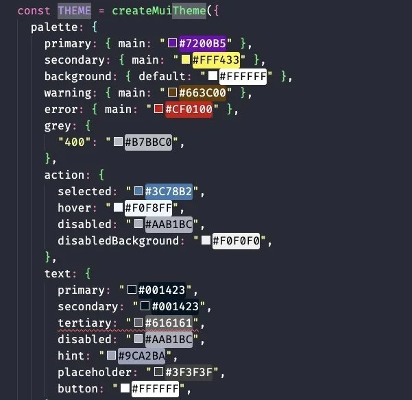
On the engineering side:
Colors are organized in a theme file that had ambiguous labels (e.g. “Text Secondary”). Oftentimes there were discrepancies between names in theme file and those used in the Figma color library
The naming system was also not scalable for possible revisions in the future.

Problem
The lack of standardized color guidelines and the presence of multiple component variations contribute to increased internal effort and extended product development timelines.

Project goals
Purposeful
How might we ensure that colors have a specific meaning based on their usage and functionality?
Scalable
How might we create a system that can be easily modified or expanded for future design changes?
Intuitive
How might we clearly communicate the purpose and intended usage of each color?
Semantic color systems support a scalable, efficient, and collaborative solution.
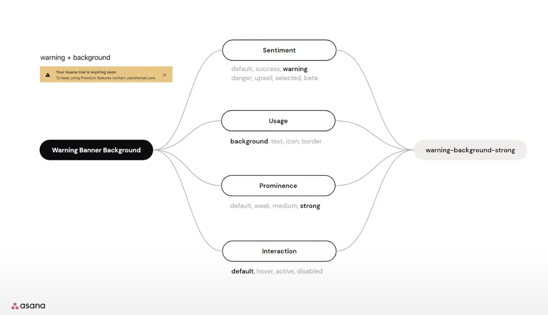
In my research, I found that many impactful companies, such as Shopify and Asana, have implemented semantic color systems in order to enhance the clarity and purpose of their color palette and create a more cohesive and consistent design. These examples have served as valuable inspiration for ZenBill in developing a semantic color system.
Shopify Polaris


Asana’s Design Tokens
Advocating for a new system amidst pushback from engineers
When discussing the potential adoption of a semantic color system with my front-end team, they shared reservations, citing concerns about the increased complexity of the naming convention and the initial effort required to implement it.
However, I believed that the benefits of a semantic color system would far outweigh these initial challenges. I came back to my team with strong reasoning as to why I felt a semantic color system would bring immense value in the long run. After much discussion, the team was on board.
Advantages of a semantic color system
Improved clarity: Using clear and descriptive labels for each color will make it easier for designer and developers to understand the intended use of each color
Increased efficiency: Streamlining the design and development process and reducing manual time spent on color choices
Enhanced scalability: Building upon a system that can be easily modified so it can remain cohesive even as the product evolves.

The Design System Efficiency Curve demonstrates that initially, there is a dip in productivity as the team becomes familiar with the new system. However, once the system is fully implemented, productivity surpasses the standard level, resulting in increased efficiency and effectiveness.
ZenBill’s Semantics Color System
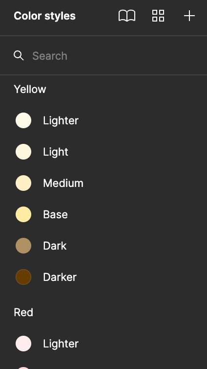
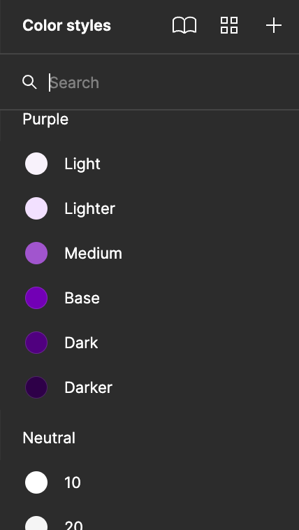
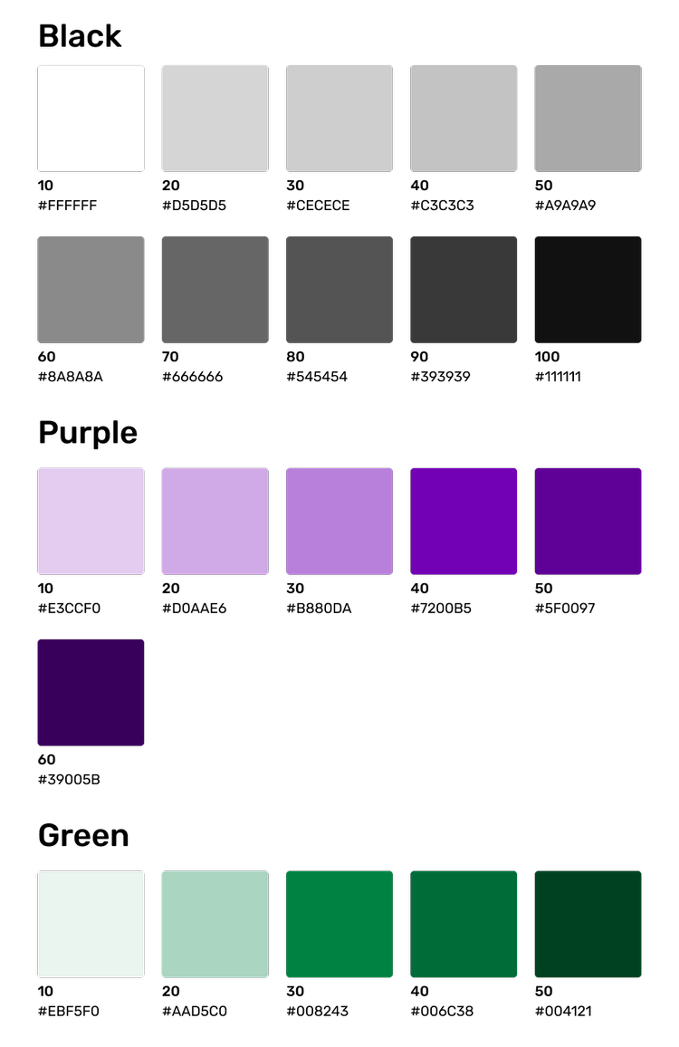
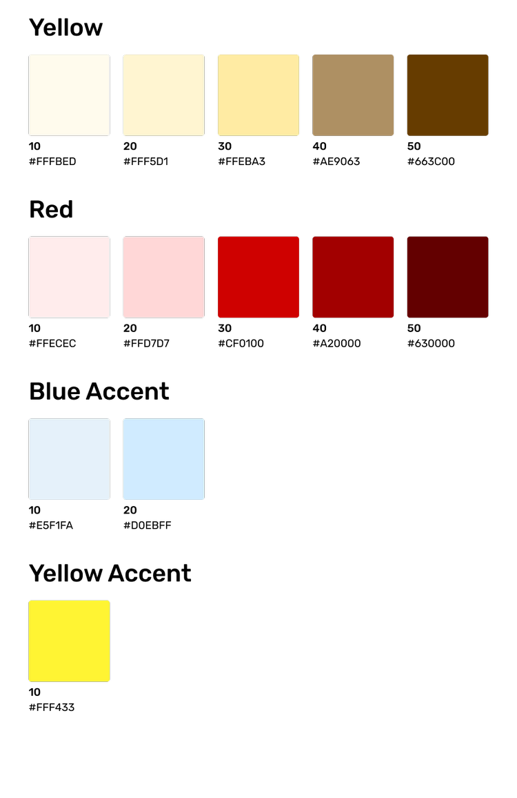
The Base Palette
ZenBill's base color palette was carefully selected to include core colors that are already commonly used throughout our product. This base palette represents all of the colors that can possibly be used.
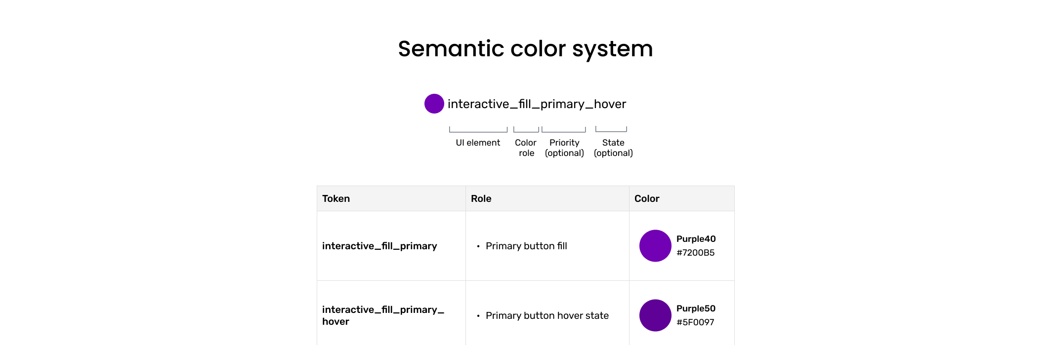
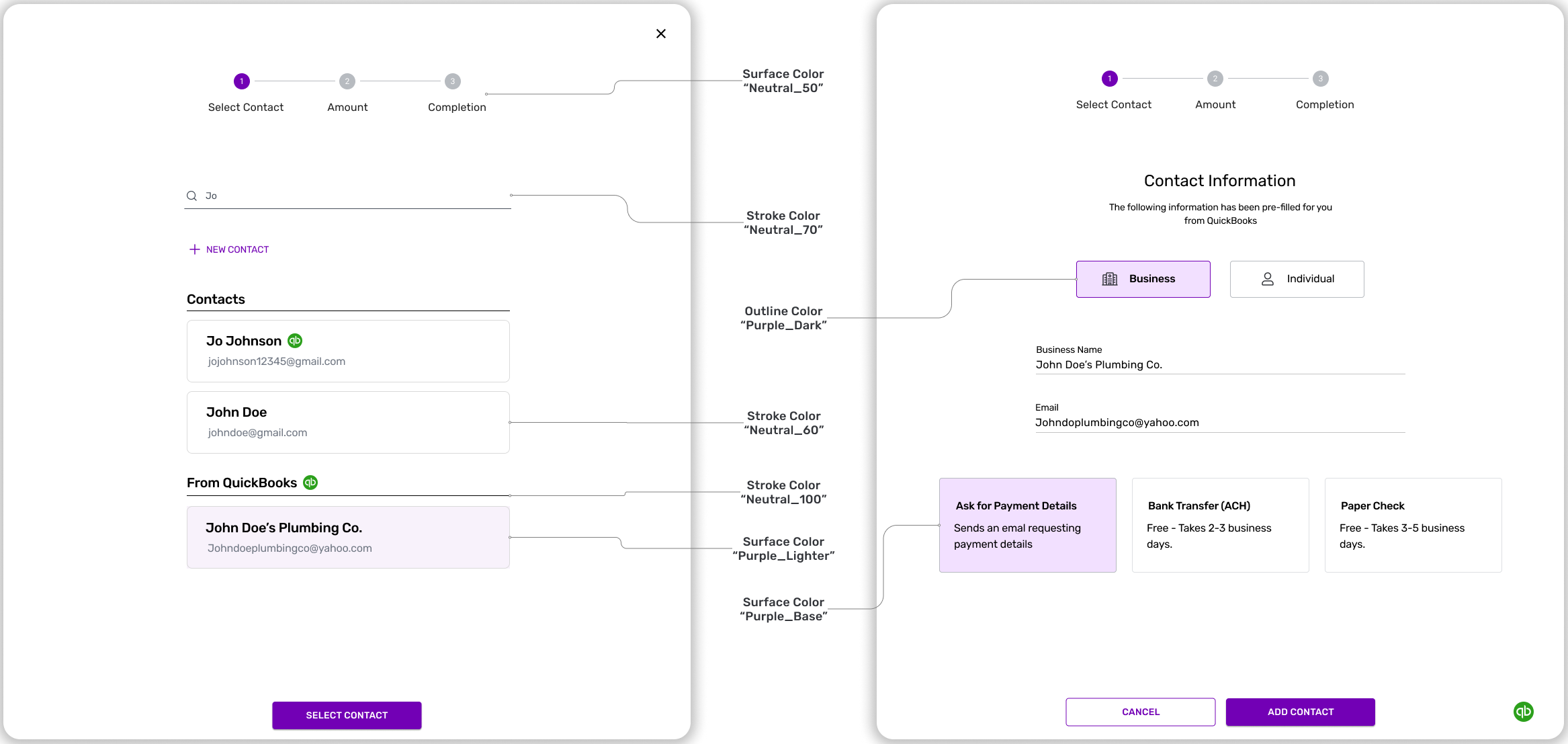
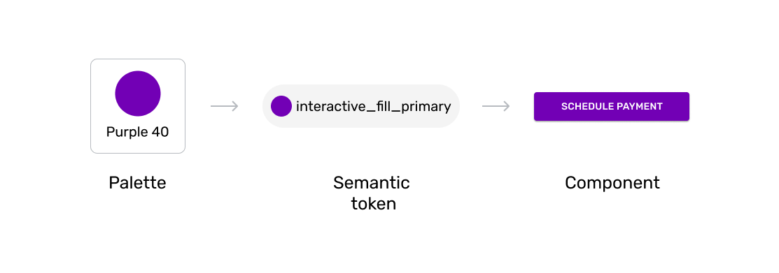
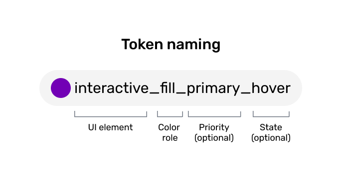
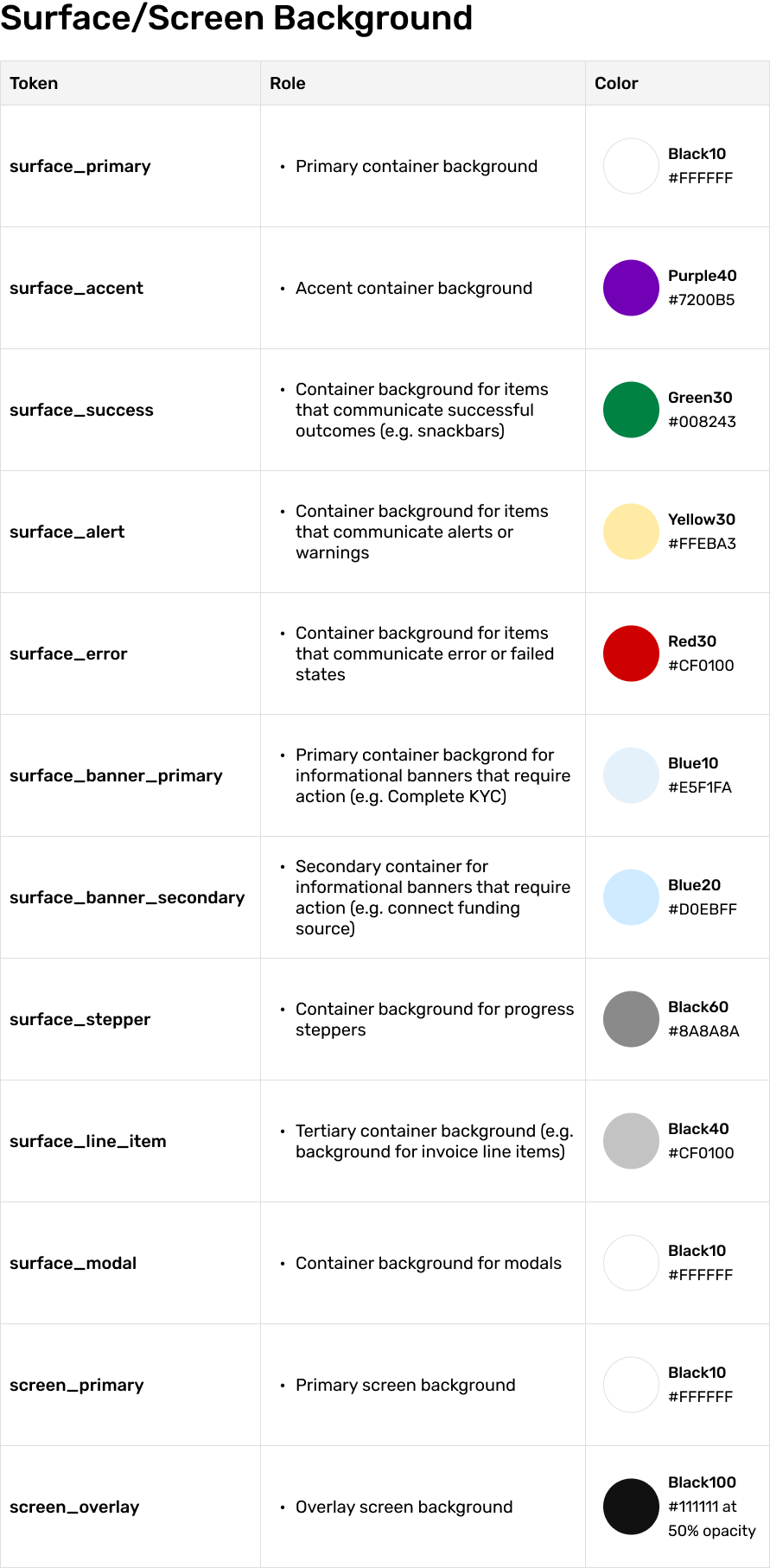
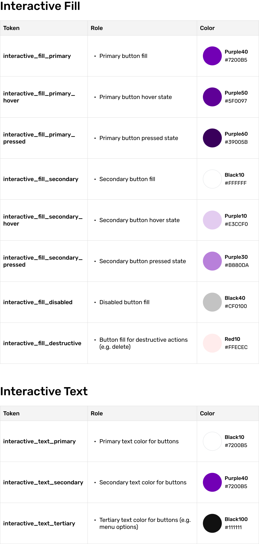
Semantic Colors - A Token Based Approach
To ensure that our color system was effective and efficient for both design and development, I collaborated with my engineers to implement a token-based approach. This approach uses design tokens, which act as the source of truth for naming colors across design and code, helping to create a shared language and improve communication between teams.

Impact
The new color system boosts work efficiency by 40%
As a designer, I was able to complete my design objectives 30% faster with the new system and resulted in fewer changes to main components, which increased consistency.
Our front-end developers reported a 40% increase in their work speed when implementing designs, thanks to the clear guidelines provided by the new color system, which eliminated the need for manual decision-making regarding color choices.